Afoot Designing in the Age of AI
A product design case study on building with AI, the death of the traditional design process, and why judgment matters more than ever
2019 - Neelam the UI designer
Round 1
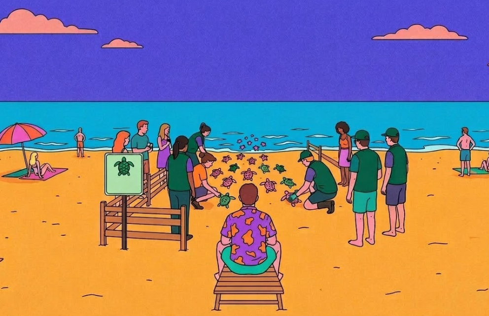
In 2019 I designed a brand for a travel company with an uncomfortable idea at its core. What if your holiday made things better, not worse?
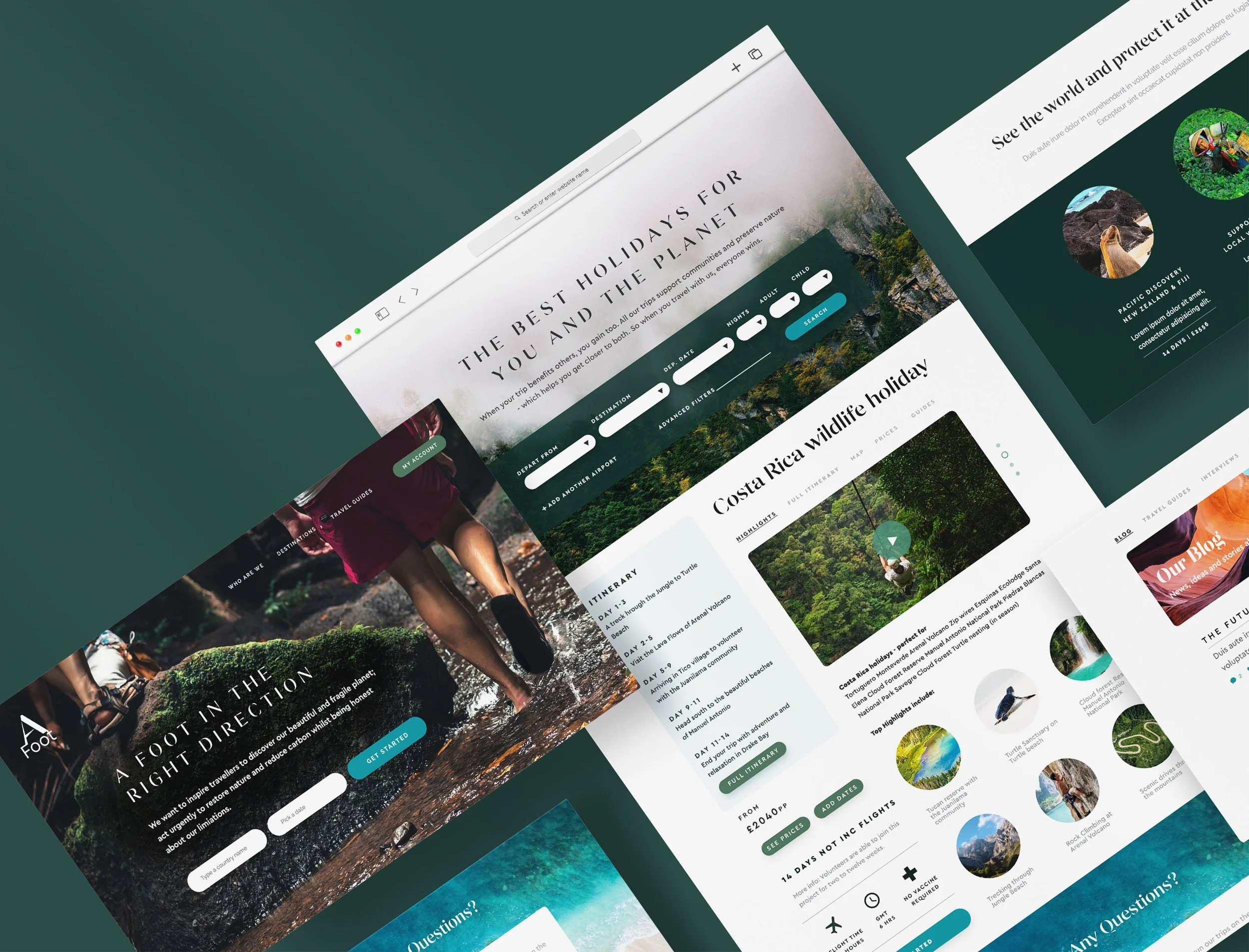
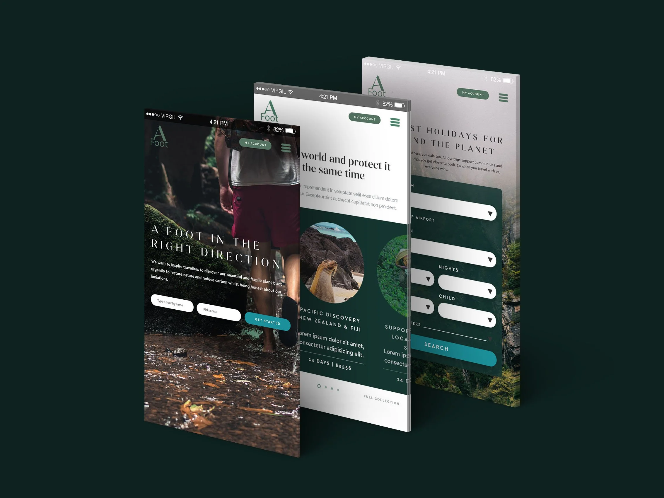
The brand looked the part. Deep greens, editorial serifs, photography that made you feel the weight of moss under your boots. But underneath it, the experience was still a brochure. Search a destination, read an itinerary, see a price. The mission was radical. The product was conventional.
Five years later, Afoot came back with a bigger question. Sustainable travel had grown and so had its problems. Greenwashing had become an industry of its own and users had learned, rightly, to be sceptical. Afoot didn't want to shout louder than the noise. They wanted to build something the noise couldn't fake.
That was the brief. And it arrived at exactly the moment the tools available to me had fundamentally changed.
This is a case study about what we built. It's also about what it means to design when AI can execute faster than you can think, and why that makes the thinking matter more than ever.
2025 - Neelam the Product designer
Round 2
Afoot's users weren't disengaged because they didn't care about sustainability. They were disengaged because they couldn't feel it.
They could read that a trip supported local communities in Kenya. They could see a carbon offset number. But they couldn't imagine themselves there. They couldn't picture what Tuesday would look like, what they'd be doing with their hands, what they'd feel at the end of a day working at a wildlife sanctuary. That emotional distance was the conversion problem. And no amount of better copywriting or prettier photography was going to close it.
The brief became clear: stop describing the experience. Deliver it.
Three things had to be true for that to work.
The product needed to feel immersive, not informational.
It needed to build trust without leaning on statistics that users no longer believed. And it needed to respect the way people actually make decisions about something this significant, which is slowly, with a lot of browsing and very little commitment until they're ready.
That's what we designed for.
The problem
Sustainable travel has a specific conversion problem that most sites try to solve with content. More information, more testimonials, more impact statistics. But information wasn't what was missing.
The real problem was imagination.
Booking a volunteering holiday asks something unusual of a user. It asks them to picture themselves not lounging by a pool but working. Getting up early. Getting their hands dirty. Doing something genuinely unfamiliar in a place they've never been. That's a harder sell than a beach resort, not because the experience is worse but because it's harder to visualise.
Three specific gaps were driving that drop off.
Users couldn't locate themselves in the world. A list of destinations doesn't create desire. A map does. There's something about seeing where you're going in relation to everything else that makes a trip feel real in a way a search result never can.
They couldn't picture the day. "You'll work alongside conservationists" is a sentence. "Tuesday morning you're tracking sun bears through the Bornean rainforest" is an experience. The difference between those two things is the difference between browsing and booking.
And they couldn't commit gradually. Volunteering holidays aren't impulse purchases. Users needed to explore, collect, compare and warm up to a decision over time. A linear booking flow was asking for commitment before trust had been built.
Each of those gaps became a product decision. But before getting to what was built, it's worth being honest about how it was built, because the process shaped everything.
The process…
…was different
Jenny Wen, head of design at Anthropic, recently said the design process designers have been taught to treat as gospel is basically dead. Mocking and prototyping has dropped from 60-70% of the design role to around 30-40%. The rest is now execution and judgment applied in real time.
This project was built entirely inside that shift.
The tool was Lovable, an AI application builder that generates working React code from natural language prompts. The entire product was built in under two days of focused work. No separate prototyping phase, no lo-fi before hi-fi. The browser was the canvas and every decision was tested in a live working product within minutes. I gave it a journey, a brand guideline and a couple of pages of well thought out UI using a think but powerful design system.
The budget was 100 credits. Finite and expensive enough that every prompt had to count. Early broad prompts burned through credits and produced outputs that needed undoing. Precision became the core discipline of the project. To sharpen that, Claude was used to refine the Lovable prompts before sending them. AI briefing AI. But that chain was only as strong as the design clarity behind it. The most important work happened before a single prompt was written.
Then the journeys started breaking.
Pages weren't connecting. A user arriving from a homepage card landed somewhere that looked like a booking page. A user coming from the map was still exploring. No prompt could fix it because the problem wasn't in the code.
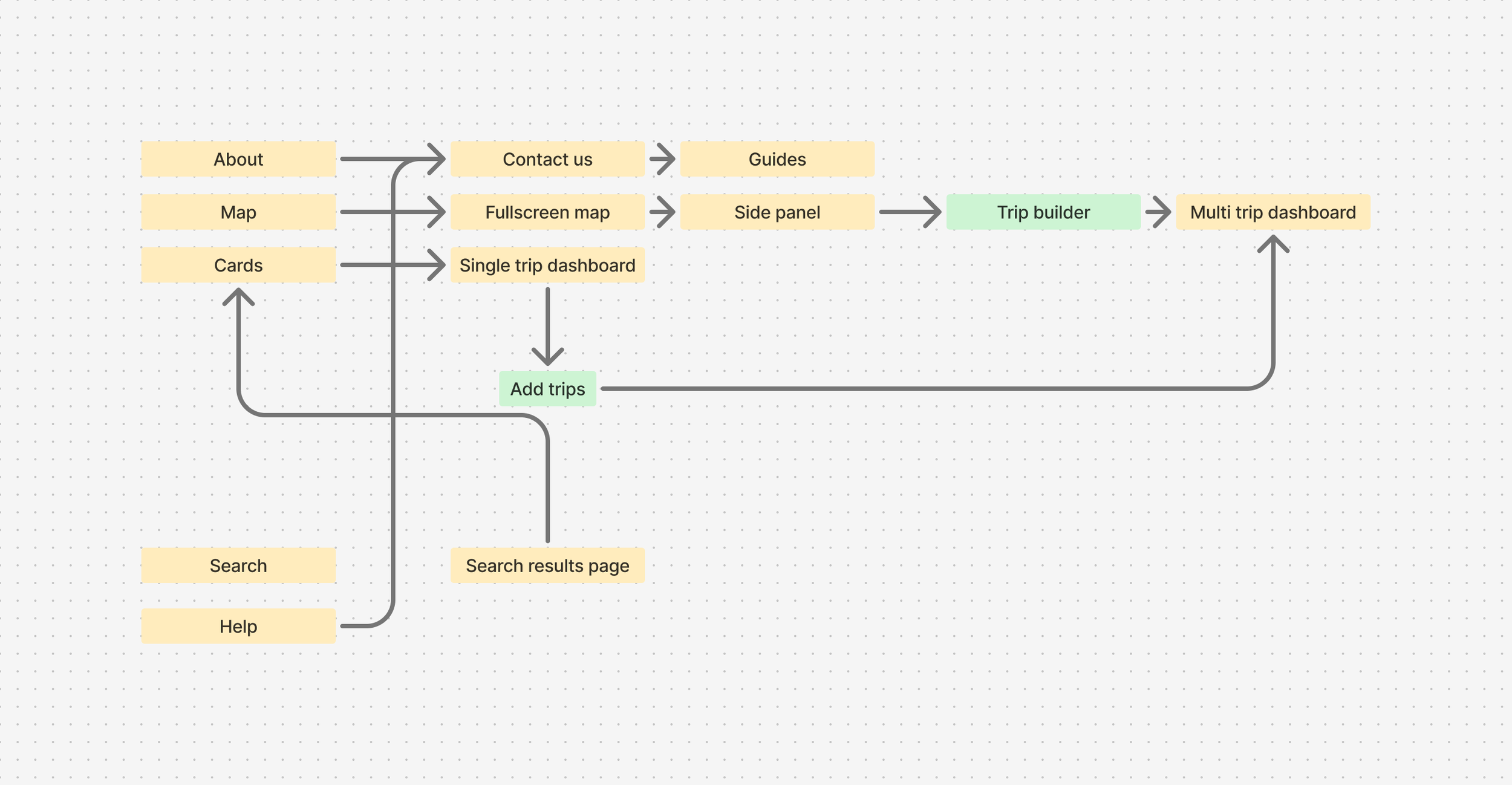
When journeys started breaking between pages, no prompt could fix it. The problem wasn't in the code, it was in the flow. Going back to Figma to map the full user journey made visible what Lovable couldn't show: that homepage card users and map users were being routed to fundamentally different experiences. This sketch was the moment the dashboard stopped being a page and became the connective tissue of the whole product.
That step back, and the UX knowledge to recognise what was broken and why, was what no AI tool caught. Without it those disconnected journeys would have shipped.
The visual language emerged differently too. Rather than building a design system upfront, the project started with a brand direction. Typefaces, colours, button styles and visual references fed into Lovable at the start. A consistent visual language emerged from the product rather than preceding it. If this moved into a full production build, that language could be pulled directly into Figma and formalised from there. The sequence just runs in a different order now.
The artifacts of this process don't look like wireframes. They look like a flow diagram and a chat window full of precise considered prompts. Different deliverables. The same thinking underneath.
The solution
Three problems. Three product decisions.
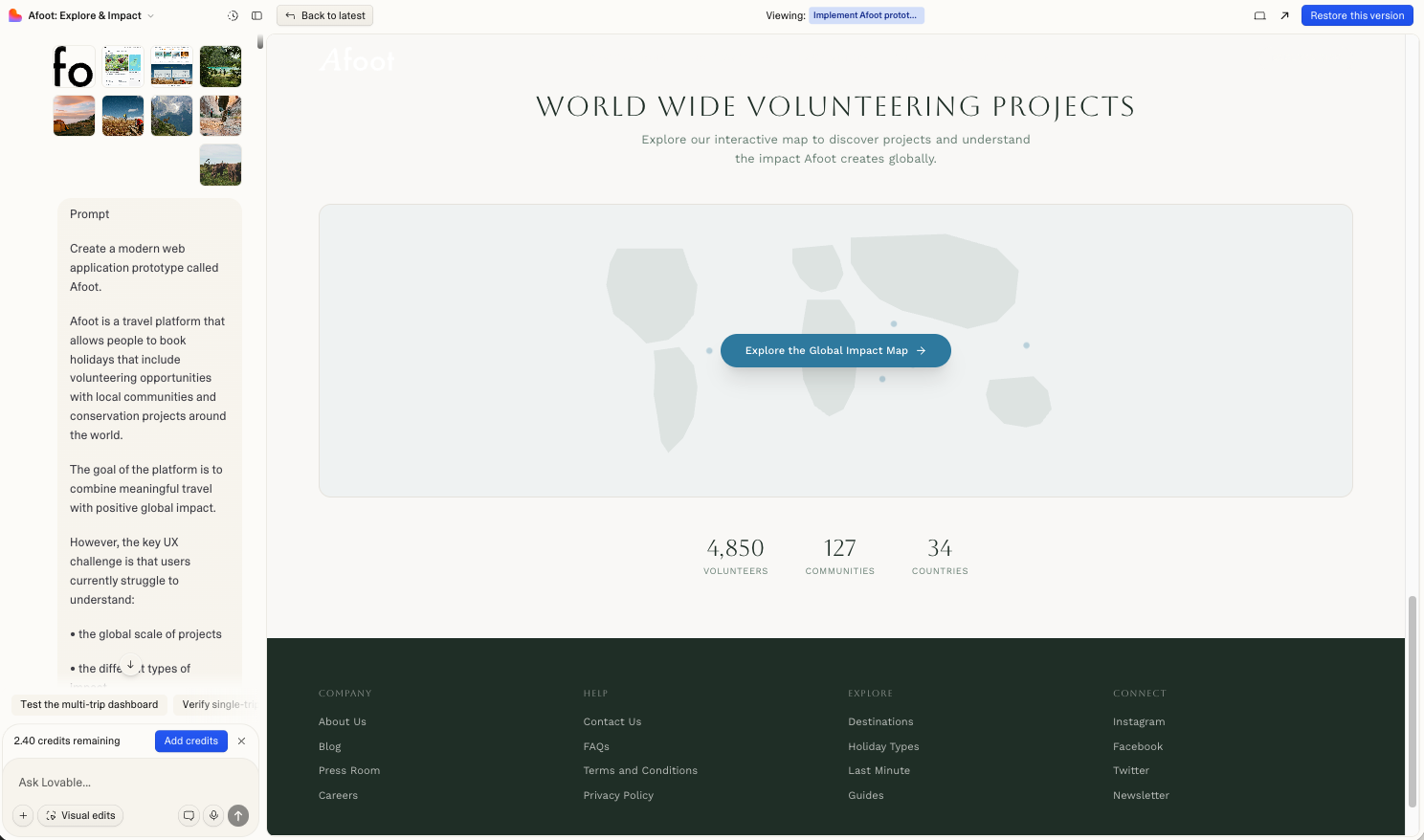
The first was the map. Not a search results page with a map toggle but a full screen interactive world that you enter before you've decided anything. The idea was that exploration should feel spatial and cinematic, the way planning a real trip feels when you spread a map across a table.
The second was the trip dashboard. A day by day breakdown of exactly what you'd be doing, built around a specific itinerary in a specific place. Close enough to the real experience that a user could start to inhabit it before they'd committed to anything.
The third was the TripBuilder. A lightweight way to collect trips across different regions without committing to any of them. The commitment could come later. The exploration could happen freely.
Now here's where it got interesting to actually build.
Building the map
The first output from Lovable looked like this.
The first attempt. Markers were HTML elements positioned over a static image. They jumped on pan, broke on zoom, and felt nothing like the spatial cinematic experience the brief needed. The prompt hadn't been specific enough. That was the real problem.
Getting from that to something that worked required a different kind of thinking. Not visual thinking. Specification thinking. What exactly does a cinematic map feel like? It loads with a zoom out animation so you feel the scale of the world first. The markers pulse gently so they feel alive without being distracting. When you click a region the map flies to it, tilts slightly, and holds. The transition takes two seconds because two seconds feels intentional.
Getting the pins to sit correctly across all six regions took more iteration than almost anything else on the map. Lovable needed to understand not just that markers existed but exactly where they sat geographically and how they related to the regions they represented. Imprecise prompts produced markers that drifted. Each correction required a prompt precise enough that nothing else moved in the process.
The technical solution was switching from HTML positioned elements to native MapLibre markers anchored directly to coordinates, and from Mapbox to MapLibre entirely to avoid unpredictable billing. But the decision that mattered wasn't technical. It was knowing that the map needed to feel like an environment you enter, not a feature you use.
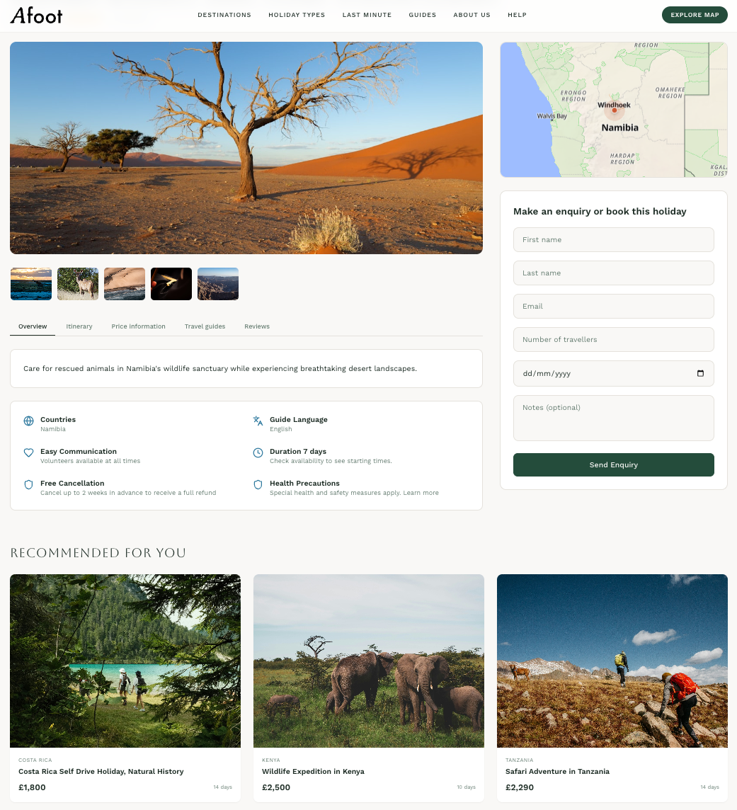
Once a marker is clicked the map flies to the region and a panel slides in from the right. This is where the product has to start earning trust.
The panel opens with an autoplaying video. No controls, no play button, just footage of the place running quietly behind the content. It shifts the register from browsing to watching. The user is no longer reading about a place. They're looking at it.
Below the video the panel tells you three things about the region before it tells you anything about the trips. The political context. The climate situation. The best time to visit. A user who understands the place before they see the trips is already imagining themselves there. That's a different quality of attention than someone scanning a list of options.
Then the projects appear. Each one has a type, a difficulty level and an availability tag. Beneath that a single honest line about what you'd actually be doing. No statistics. No impact percentages. Just the work.
Exploring a Region
The TripBuilder lives at the bottom of the screen as a sticky bar. Invisible until you add your first project, then it animates up quietly and stays there. No interruption, no modal, no forced decision. Just a record of what you've found so far.
Users can move between regions, watch different videos, read about different projects and keep adding. The bar grows with them. Each project becomes a removable pill. The total trip duration calculates automatically. It's designed to feel like a shortlist, not a checkout.
That distinction matters. The moment a product starts to feel like a checkout, commitment anxiety kicks in. The TripBuilder deliberately never crosses that line.
Building it exposed one of the sharpest challenges of the whole project. State management across panels. A user would add a project from the Africa panel, navigate to South East Asia, add another, and the first one would quietly disappear. Lovable was scoping the TripBuilder to whatever was currently open rather than treating it as persistent global state.
Fixing it required the same discipline the map had already taught. One thing per prompt. Explicit about what to leave alone. Every attempt to fix the persistence that also tried to improve something else broke something that was already working.
When it finally held, the TripBuilder did something none of the original designs had anticipated. It made the multi-region journey legible. A user could hold Africa and Borneo in the same bar, see the combined duration, and start to understand what a real trip might look like. That sense of a joined up world was exactly what the 2019 design had tried to create editorially. The TripBuilder created it interactively.
From Exploration to Commitment
Before - Single booking
After - Multi-trip booking
The dashboard changed structure more than anything else on the project. It started stacked, became a split screen, collapsed back to stacked three times when prompts meant to fix content accidentally broke layout, and eventually landed back where it started. Split screen was always right. It just took losing it repeatedly to be certain.
The more interesting problem was the entry points. A user from the homepage had one destination. A user from the TripBuilder had several across multiple regions. The dashboard needed to hold both without feeling like two different products.
This is where the broken journeys discovered in Figma became a design decision rather than just a bug. The original assumption was that homepage cards would route to a booking page. But a user who'd spent thirty seconds on the homepage hadn't earned the right to be asked to book yet. The dashboard became the answer. Not a booking page and not a browse page but something in between. A place where a user could arrive from anywhere and get the same depth of experience regardless of how they got there.
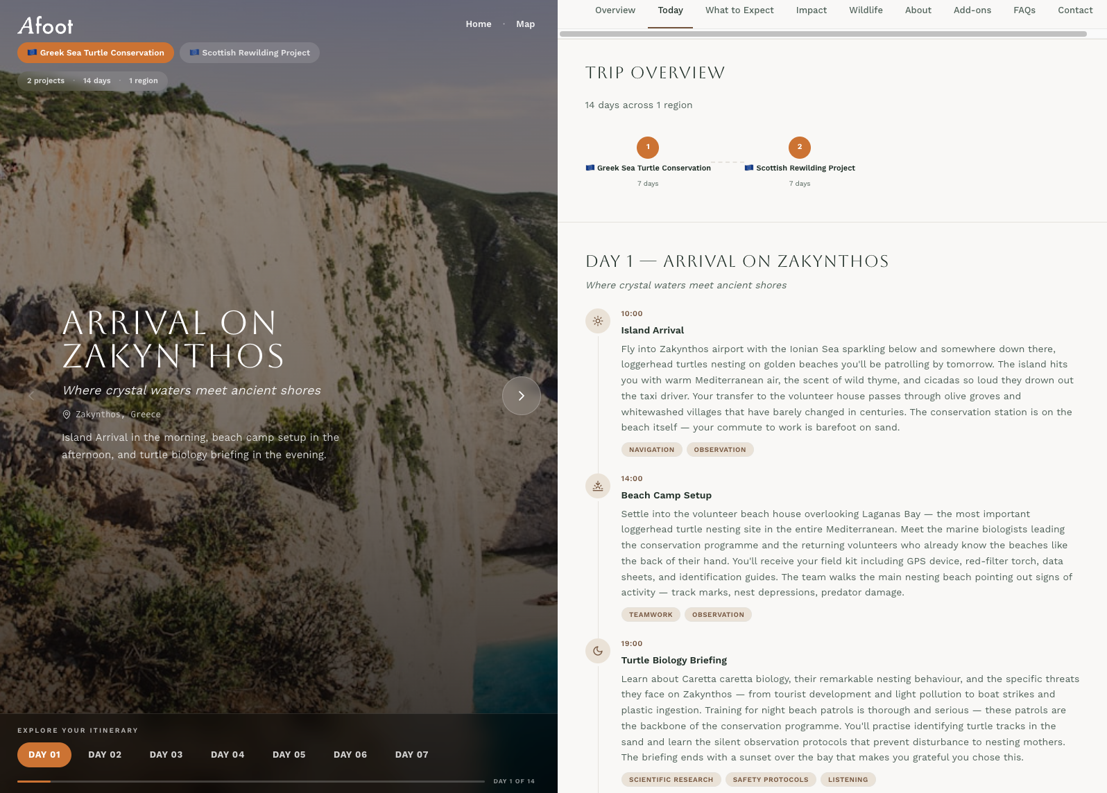
For single trips the left panel became a day by day visual journey. Each day pulled a different image based on that day's specific activity. The image changed as you moved through the itinerary. It stopped feeling like a schedule and started feeling like a preview.
For multi-trip a project selector sat at the top of the left panel. Switching projects crossfaded the image and updated everything below. Combined impact, wildlife grouped by region, a progress bar across the total trip. Seeing Kenya next to Borneo in one connected view gave users something the 2019 design had tried to do editorially. The geography became part of the story again.
One deliberate choice ran through all of it. No pricing on detail pages. No booking form until the very end. No made up statistics. Just specific honest statements about what your presence would actually contribute. The user who reaches the contact form after twenty minutes inside the dashboard is a different user to the one who bounced from a booking page. That's who this was built for.
The trip dashboard
Reflection
This is a prototype, not a product. The distinction matters.
The data is placeholder. The organisations are fictional. The impact statements are honest in tone but not yet grounded in real partnerships. Before this becomes a real product those things need to be true, and making them true is a different kind of work than building the experience around them.
What’s next
The design process is changing faster than most designers are ready to admit. The mocking, the wireframing, the careful handoff, those things haven't disappeared but they've shrunk. What's expanded is something harder to name. Judgment applied earlier, thinking made explicit before execution begins, decisions owned rather than deferred to a process.
This project ran on 100 credits and under two days of build time. It produced a working multi-page product with a live map, a video-driven exploration panel, a persistent trip builder and a day by day immersive dashboard. That would have taken weeks the traditional way.
But the speed was only possible because the thinking came first. Every vague prompt cost money and produced work that needed undoing. Every precise prompt, one that named the problem, specified what to preserve and described what the user needed to feel, produced something worth keeping. AI was even used to improve the prompts themselves, but that chain was only as strong as the design clarity behind it.
What AI couldn't do was catch the broken user journeys. It couldn't see that the homepage and the map were routing users to fundamentally different experiences. It couldn't know that a user arriving from a card click wasn't ready to book yet. Those were design calls, grounded in UX knowledge, caught by going back to Figma and mapping flows by hand.
That's the honest version of AI-native design. Not easier. Faster, yes. But faster in a way that raises the stakes on thinking clearly, knowing your user and understanding the problem before you touch the tools. The accountability doesn't disappear. It sharpens.
The 2019 version of Afoot was a beautiful answer to a question that hadn't been asked precisely enough. This version started with the user's problem and worked backwards. Five more years of knowing what design is actually for made that possible. The AI just made it buildable.